
Archive
Painting the town Red Corporate Jamaica’s fascination with the Colour Red?
Although not publicly acknowledged, observation will however prove that Digicel is now in a major battle with Claro for the share of mind for Red, a clash that will reveal just how consumers will identify them with the colour. The Claro logo is a 100% red sphere/ball with white branding letters, while Digicel’s logo is red and green letters on a usual white background. Digicel primarily uses red in all of its consumer advertising material.

Claro is now here with it, Digicel is into it big time, so too is Red Stripe obviously, JMMB, Texaco, Total, GraceKennedy, Scotiabank, KFC, Toyota and numerous other corporate and brand logos. It’s the colour RED, they all have it in their designs and some are even battling for rights to own it among consumers.
![]()
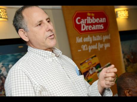
The proliferation of red in branding designs and print communication has created blurring lines among consumer. The impact of this particular problem was recently played out at the National Stadium here in Jamaica during the football match between Jamaica and Mexico. On entering the stadium there was red everywhere, but it was distributed between Red Stripe, GraceKennedy, Digicel and JMMB. All four companies have red in their designs and in the vast sea of red; it was hard to determine who was where at first glance.
Although not publicly acknowledged, observation will however prove that Digicel is now in a major battle with Claro for the share of mind for Red, a clash that will reveal just how consumers will identify them with the colour. The Claro logo is a 100% red sphere/ball with white branding letters, while Digicel’s logo is red and green letters on a usual white background. Digicel primarily uses red in all of its consumer advertising material.

To further compound the matter, Digicel is (was) also using the red sphere/ball treatment with white letters in a very aggressive way in a recent print and outdoor advertisements. This was very evident over the last quarter leading up to Christmas two years ago, and any one making the trip to and from the Norman Manley Airport in Kingston would be convinced of this as Digicel was seen in abundance. Many would suggest that this was a deliberate attempt to confuse the consumer, but it could also be the basis for a legal brand infringement challenge by Claro, but that is the subject of another article Businessuite is working on to share with its readers.
With the vast array of colours now available, one would have thought that there would be more than enough to go around. In 1666, English scientist Sir Isaac Newton discovered that when pure white light is passed through a prism, it separates into all of the visible colours. Newton also found that each colour is comprised of a single wavelength and cannot be separated any further into other colours. Further experiments demonstrated that light could be combined to form other colours. For example, red light mixed with yellow light creates an orange colour. A colour resulting from a mix of two other colours is known as a metamer. Some colours, such as yellow and purple, cancel each other out when mixed and result in a white light. These competing colours are known as complements.
But there is far more to this fascination with Red than meets the eye. Logo and branding colour selections are not arbitrary; the decisions are usually backed by a wide array of consumer research and lengthy internal deliberations.
Colour Psychologists who study the psychological effects of colour suggest that while perceptions of colour are somewhat subjective, there are some colour effects that have universal meaning. Colours in the red area of the colour spectrum are known as warm colours and include red, orange, and yellow. These warm colours evoke emotions ranging from feelings of warmth and comfort, to feelings of anger and hostility.
Colours on the blue side of the spectrum are known as cool colours and include blue, purple, and green. These colours are often described as calm, but can also call to mind feelings of sadness or indifference.
In essence marketers have tapped into colour as a means of influencing how consumers view and respond to their brands. Their reaction to colour is almost instantaneous and has a profound impact on the choices they make every day.
So, why the fuss over red? Let’s look at the meaning based on information found on the internet.
Meaning of the Colour Red
Red has more personal associations than any other colour, and has deep emotional and spiritual connotations. Recognized as a stimulant, red is inherently exciting and the amount of red is directly related to the level of energy perceived. Red draws attention and a keen use of red as an accent can immediately focus attention on a particular element. Red is power, hence the red power tie for business people and the red carpet for celebrities and very important people (VIPS). Flashing red lights denote danger or emergency. Stop signs and stop lights are red to get the driver’s attention and alert them to the dangers of the intersection. Red evokes strong, often conflicting emotion, from red hot love, ala Cupid; to burning hate, ala the Devil.
Joy, fun, energy, power, courage, sacrifice, love, sexuality, passion, lust, revolt, aggression, anger, danger, warning, negative balance are just some of the words associated with the colour.
(Other keywords strength, fire, excitement, speed, heat, arrogance, ambition, leadership, masculinity, gaudiness, blood, war, anger, revolution, radicalism, socialism, communism, aggression, summer, autumn, stop, Mars (planet), respect, Aries (star sign), December, the Roman Catholic Church, martyrs, the Holy Spirit.)
But how does the colour red effect consumers? Studies show that red can have a physical effect, increasing the rate of respiration and raising blood pressure; red also is said to make people hungry. On a mental and physical level red is known to
* Increases enthusiasm
* Stimulates energy
* Encourages action and confidence
* A sense of protection from fears and anxiety
Experienced graphic designers know that colour triggers an emotional response in people, and will thus use colour to convey meaning in their designs, as effectively communicating concepts to customers can be difficult at times.
Lime from Cable and Wireless is presently using Black as its dominant colour having shifted from Blue. In most Western countries, black is the colour of mourning. Among young people, black is often seen as a colour of rebellion. Black can be either positive or negative, but always mysterious. In the first Western movies, the good guys wore white and the bad guy wore black. But in later works, the good guys wore black to portray that air of mystery, as in Men in Black or the James Bond films. This shows how colour meanings can change over time.
Blue for example conveys importance and confidence, without being somber or sinister, hence the blue power suit of the corporate world and the blue uniforms of police officers. Long considered a corporate colour, blue, especially darker blue, is associated with intelligence, stability, unity, and conservatism.
Colours have both negative and positive meanings, but it’s how they are used in graphic designs that will elicit a particular response. For instance, black can be perceived as either sinister or sophisticated depending on its use. Culture must be taken into consideration, for instance in the U.S., white is for weddings; while in some Eastern cultures white is the colour for mourning and funerals.
Colour is very important in designs and can be used to add spice to advertisements, relay the mood of the campaign, as well as emphasize sections of the advertisement
As soon as consumers look at an advertisement, they can usually guess within seconds what that advertisement is all about and which company it comes from with just a glance. Just as we are quick to judge other people by their appearance, and surroundings by the way they smell, look, and feel, consumers also judge an advertisment or branding design by its colour scheme and style of design. Consumers can also tell almost immediately, whether a advertisment is corporate, personal, whether it is for kids, teens, or just for adults, etc. Most of this information is perceived solely by taking in colour and design elements. BM
(Reprinted from a previous issue of Businessuite Magazine)

Agostini’s Directors Approve Interim Dividend of 40c per share

Unilever Caribbean Reporting Improved Performance, With Q1 Net Profit Up 147.2%

tTech Q1 2024 Performance – Mixed Results, Characterized By Notable Achievements And Operational Challenges.

TELSTRA Officially Acquires DIGICEL PACIFIC
Which Company Has The More Sustainable Business Model….Edufocal or ICREATE and Why?

Will Oliver Mcintosh’s Verticast Media Group Acquire CVM TV From Michael Lee Chin? Part 1
JMMB Group Limited Investor Briefing – November 16, 2023
Jeffrey Hall Is Set To Be One Of The Most Powerful Men In Corporate Jamaica And The Caribbean. So, Who Is He?

A conversation with Marcel Anderson Group Chief Executive Officer and CTO at KYO Group on the disruption they are bringing to International Fast Cargo Transportation from the United States to Jamaica.
-
 Businessuite News24 International2 years ago
TELSTRA Officially Acquires DIGICEL PACIFIC
-
 Feedback & What You Think2 years ago
Which Company Has The More Sustainable Business Model….Edufocal or ICREATE and Why?
-
 Marketing & Advertising2 years ago
Will Oliver Mcintosh’s Verticast Media Group Acquire CVM TV From Michael Lee Chin? Part 1
-

 Businessuite Women1 year ago
Joanna A. Banks Was Set To Become The Youngest And Most Powerful Woman In Corporate Jamaica And The Caribbean
-
 Businessuite 50 Power and Influence1 year ago
Businessuite Women- Power and Influence 50 For 2023
-
Leadership Conversations1 year ago
Jeffrey Hall Is Set To Be One Of The Most Powerful Men In Corporate Jamaica And The Caribbean. So, Who Is He?
-
 Businessuite Markets2 years ago
What Does Seprod’s Acquisition of Trinidad Based A.S. Bryden Have to Do with CEO Richard Pandohie’s Single Domestic Market Strategy?….Part 1
-

 RANKING7 months ago
Businessuite 2023 Top 100 Caribbean Companies – US$ Revenue